So…yesterday I was all inspired to do a project. You know, step outside my regular routine. It was all very exciting and energizing.
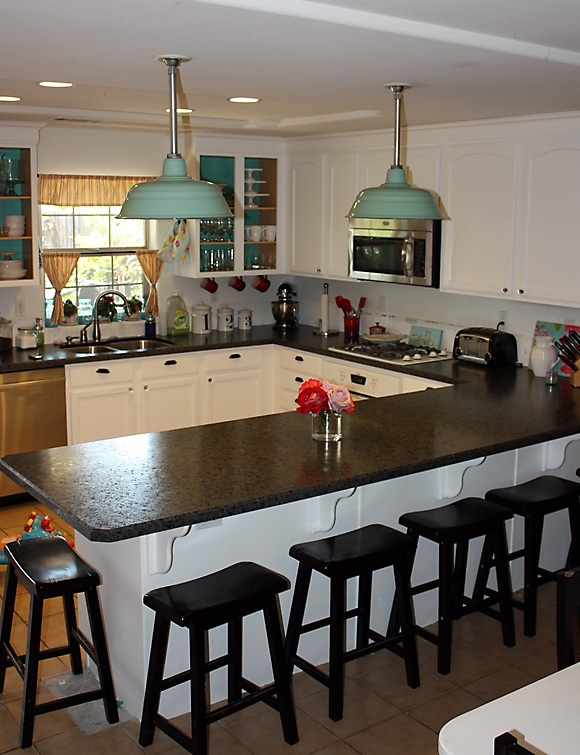
I’ve long been drooling over all of the pretty colored kitchen islands on Pinterest, and really wanted to try something similar for my kitchen. I don’t have an island, but I do have a big peninsula/breakfast bar that I thought would be fun in a punchy color.
I went back through my Pinterest boards to find some happy inspiration:
Citrus yellow?
Dusty aqua? (And don’t get me started on that pull out fridge drawer!)
Bright Turquoise?
Source: emilyaclark.blogspot.com via Jeannett on Pinterest
Another blue?
As you can see, I was really drawn to aquas and yellows…but it was THIS image that made me decide that a really bright yellow was just the ticket:
Happy, pretty, unexpected and fun.
After finding the perfect hue of sunshine, I started.
 Lemon Sorbet.
Ultra bright. Looked almost neon in Home Depot, but in my kitchen that gets terrible natural light, it was perfect.
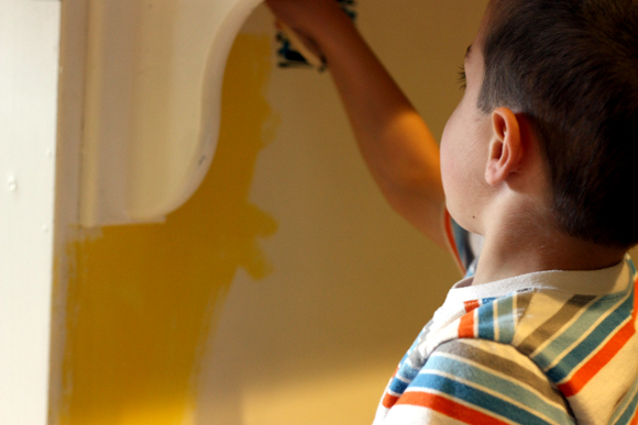
I even let Henry help while the girls napped.
And I got that nervous pit in my stomach.
Did I mention that Andy had NO IDEA I was doing this?
He was out of town. I thought I’d suprise him.
Although, after 10 years of being married to me, I have a feeling very little truly surprises him anymore.
Coming home to see that a permanent piece of furniture in your home was painted bright yellow?
Meh.
It could be worse, right?
WRONG.
Because as soon as the first coat was on, I stepped back…and almost had a HEART ATTACK.
It was AWFUL.
Terrible.
Hideous.
NOT CUTE. Not even a little bit.
He happened to call a few minutes later. Asked what I was doing. I could have lied. But I thought I’d take the high road.
“Um, how about I text you a picture? You’ll see.”
“Jeannett…what did you do?”
“Nothing really. I mean, just call me back after you get the picture.”
“JEANNETT….”
(I often think we are a modern day Lucy and Ricky Ricardo…he says my name exactly the way that Ricky used to say “Luuuucyyyy…” without the Puerto Rican accent.)
“Bye. Talk to you in a bit.”
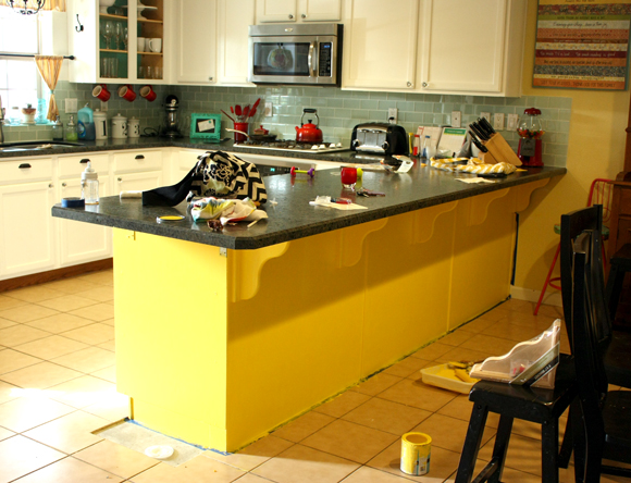
I hung up. And texted him this:
Random.
Just looks like this giant yellow blob of random in the middle of my kitchen.
He called back. Laughing.
“Jeannett. What made you think that would look good????”
“IT WAS PINTEREST!!!! IT’S ALL PINTEREST’S FAULT!!! IT’S OF THE DEVIL!!!! THERE ARE LITTLE PINTEREST GNOMES THAT PIN THINGS THAT ONLY LOOK GOOD UNDER VERY SPECIFIC SITUATIONS AND THEY FOOL YOU INTO BELIEVING YOU CAN DO IT TOO AND THEN THEY SIT BACK AND LAUGH HYSTERICALLY WHEN YOU FAIL AT IT! THERE IS A SECRET YOU TUBE CHANNEL FOR VIDEOS OF GULLIBLE MOMS ACROSS THE COUNTRY WHO DRAG THEIR PREGNANT SELVES AND THREE KIDS TO HOME DEPOT FOR PAINT AND THEN ABSOLUTELY RUIN THEIR BEAUTIFUL KITCHENS THAT THEY JUST COULDN’T LEAVE ALONE! IT’S A CONSPIRACY! IT’S THE END OF TIMES! I HAVE NEVER BEEN MORE CERTAIN OF ANYTHING IN MY LIFE!!!”
“Um, okay. Whatever. Just know that I’m not helping you paint it back to white. It’s only paint. But it looks awful.”
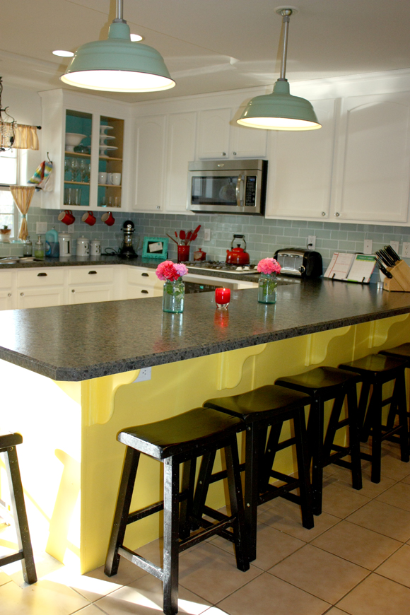
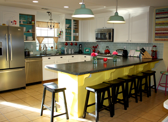
The photo doesn’t do the hideousness justice. It’s awful you guys. Don’t even lie to me in the comments. It’s ten times worse in real life.
I thought about it some more and made a very important discovery:
There is a reason people don’t pin peninsulas.
All of that happy color? Islands. Stand alone islands. A whole separate piece of furniture that is it’s own color. Like a coffee table for a kitchen. It makes sense if that’s a different color. The backside of cabinets that are white everywhere else? Should stay white. If I teach you nothing else for the rest of my life, let it be this.
Since I was tired by now, I cleaned up my mess and I’ll repaint this weekend. Awesome. Exactly how I wanted to spend my Saturday.
I put all of my stools back.
Cleared the counters.
Hoped I would magically like it.
Nope. Still hideous. Less noticeable, but hideous.
It looks like the check in for the Summer Camp for Clown Training.
“Welcome back Bobo! So glad to see you! Flower Squirting 101 is in the backroom and Pie Tossing is to your left.”
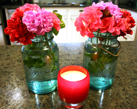 I tried to make it more “homey” and less KinderCare reception desk by cutting some gardenias and even lighting a candle.
You know, because that helps.
Bah.
So much for feeling all progressive and brave and risk takeresque.
Wind out of my creative sails?
A little bit.
Today I’ll plant flowers. Can’t mess that up.
Right?
Ever made a giant crafty fail?
(For the record, this was probably the worst one so far…typically things come out looking good and how I imagined them…this just happens to be the most noticeable.)








Oh my, it is yellow! I think the main thing is it blends in with the floors too much. I don’t think a contrasting color was a bad idea, you were on the right track, but perhaps one of the turquoise colors, or even a gray would be really nice. But probably want to play it safe this time and go back to white huh? Sorry :(
Andrea Howe´s last blog post ..Crap, I’m Pregnant
The color is crazy bright, but really, I don’t think it’s an issue of having the wrong color in this case. I think it just doesn’t work because it’s not a stand alone island. It’s for sure going back to white…although I maybe be putting up that bead board I’ve been meaning to do.
As for the floors, yeah, we are planning on putting down more of the wood in the kitchen and pulling up that terrible tile…it just hasn’t happened yet. Not that I think that would solve my problem for the time being. :(
Ditto what she said. A nice grey or an aqua theme would be great here…
texting you a picture of my bathroom fail now… it will make you feel so much better.
I actually do like the color, but this is coming from someone who painted their entire kitchen a bright lime green. It balances all the black appliances and counter tops for me though. But man, it was a shock when I was finished! I love it now though.
Heather´s last blog post ..emma’s sweater dress
I like the color too…I just think it doesn’t work where it is if that makes sense. :)
jeannett´s last blog post ..When Pinterest Bites Back
When I was pregnant I painted all the baseboards in the basement with the wrong paint. I used flat. It looked terrible.
Oh Jeanette! I’m so sorry. I’ve had many craft fails, but haven’t photographed any of them so far. Pinterest is evil, isn’t it? That must be why I spend HOURS drooling and pinning! I hope you love your peninsula as soon as it’s back to white. And I wish you luck with Pinterest. I haven’t been able to break my addiction yet lol!
Lynn @ Scrapity Anne
Lynn @ Scrapity Anne´s last blog post ..The Empty Wall
aw! Darn those Pinterest Gnomes! ;)
Michelle – Daydream Believers´s last blog post ..Final Day of the Choose Joy auction for Ashley
I agree with Heather.
I like it,
But if you are still wanting yellow, but not something so bright. Try a buttercream yellow. Good Luck.
you had me at kindercare reception desk. hahaha.
i wont lie, it is not cute.
it is totally channeling it’s inner pre-k.
since you’re gonna paint it anyway, what about a pretty neutral tone, a mocha or a beige-y color?
but white is always good too.
i love white.
every wall in my house is white.
and i have a lot of walls.
i make no apologies for it.
boo hoo on ugly yellow! but mega points for trying, for sure!
it’s bad. i know. but it’s going back white. i don’t think that color selection was really the issue here…just placement. that area wasn’t meant to be a different color. boo.
You look at your before kitchen and the first pin and it should work it should be perfect and adorable but it’s not and I think you’re exactly right on why! I think it’s a mistake anyone would make. Thanks for sharing your craft fail. We all have them, but we aren’t all brave enough to share them. :-)
Ashlee´s last blog post ..Super cute Child's bag
right?! it should totally work…except it doesn’t. ugh.
oh my….this post totally stressed me out. I was literally shouting at the computer saying, “Noooooooo!!!! Don’t paint it yellow!!!! Keep it white” Sorry about the fail….but, thanks for the entertainment :)
Mel @ The Larson Lingo´s last blog post ..Soup’s On: Baked Potato Soup
glad i could be of service mel. ;)
jeannett´s last blog post ..When Pinterest Bites Back
It’s the dark counter tops- notice all the pretty pintrest pictures have super light/white ones. I like the idea of bead board though!
Britta @ The Handmade House´s last blog post ..JennyLund Love
Wow. Well you gave it a shot! I agree that it might just be too bright or the dark counters vs the light ones in pictures! You might want some killz though when you paint it back white… You have my props for trying it out though!!
Karla´s last blog post ..New Rules of Lifting for Women
oh yes. the kilz has been bought.
I won’t lie, in the first picture it looks horrible. The second picture doesn’t look as bad, but I think it clashes with your counter top and stools. That’s just me. But good try at least. You would never have known unless you tried.
When we first moved into the house we are living in now, we painted our room this bright green color. I thought it would go good with the browns of our furniture and bedding. It was horrible. My husband nor I liked even being in the room. For some reason we left it that way for a couple months. I don’t know, I guess we were trying to see if it grew on us or not. A big not. We ended up painting it a warm light brown and now we love it.
What if you stuck to a lighter turquoise than what’s lining your cabinets by the window? Or get some new curtains and then match the new color to them? I think a yellow would like nice in your kitchen — but a paler, softer yellow.
And BTW — Ricky was Cuban. ;)
Kelly @ Creating a Family Home´s last blog post ..Something Different
First, I agree that the yellow is not good. Doesn’t go well with your floors. Sorry!
BUT – I think a white beadboard would look awesome, or if you want to paint a color, the dusty turiquoise would be beautiful.
hahahaha, I wouldn’t say it looks good. But you are REALLY brave for trying. And it seems like it plops you in the camp of the cool kids who can pull off a crazy color in one part of their kitchen.
And I’m so glad you posted pictures! I screw things up all the time, but we rent, so it’s usually something smaller than a peninsula. I’m fixin’ to do a post soon on some pinterest stuff I tried that didn’t work AT ALL.
Janice´s last blog post ..In a nutshell
I really don’t think it looks that bad! By the last photo, it kind of grows on you! LOL! But seriously, I think if you went with paint the color of your light fixtures? THAT would look awesome! Best of luck whatever you decide to do.
Kate Ware´s last blog post ..PageMaps Sketch and a Contest!
Ok it must look worse in person or else I am just CLUELESS. …. both very possible. Anyways, my pinterest fails so far have all been hair related. I keep seeing pins on making sexy beach wavy hair which I LOVE. I, however, have natural curl so every tutorial I have tried thus far has left me looking like I crimped my hair. Not cute. I have stress-inducing nightmares about my early 90’s hair and I DO NOT wish to repeat it thank you very much.
On a side note I LOVE your kitchen despite the yellow addition. :)
OH AND my twins got fitted for braces today. I am struggling a bit with them starting kindergarten in the fall with braces up to their knees but odds are they WON’T care and I am just being paranoid.
Sadly, you’re right, it IS awful… but chalk it up to a fun craft project you did with Henry and paint over it stat. AND LOOK, IT’LL BE ANOTHER FUN CRAFTY PROJECT WITH HENRY!
You’re welcome!
Carmen´s last blog post ..I was awesome. And then this happened
Maybe paint the peninsula back white, and paint the scoll-y dividers (? having a moment of brain fog, and don’t know what else to call them) around the stools and aqua to match the inside of your cabinets. (Maybe, maybe not)
I actually like it!
I really don’t think it is all that horrible. I do think a color to coordinate with the backsplash or the light fixtures would look fabulous. I would try that. Don’t give up!!
Leah´s last blog post ..Life Lately – January 2012
I would paint it red! You have red accents here and there, it just might work. But yeah, yellow has to go.
kresspress´s last blog post ..Birthday Party: Alameda Bowl
I feel kinda responsible since I think you got that yellow picture off one of my boards.. you can just tell Andy it’s was all my fault!!! tell him the “crazy mail order bride” made you do it! love you.
Yellow is a tough color to pull off and very hard to get the shade you want from a swatch. I painted a small room school bus yellow by accident once. 9×10 room that looked like big bird exploded in there. I added white for the next coat and now it’s just bright tropical yellow. I have to agree with you, I don’t like the yellow. I think your kitchen looks fantastic just the way it was. Luckily it’s only paint and it will go back to just the way it was. Stick with the 2 accent colors of red and turquoise. 3 accent colors is too much. Red & yellow, turquoise and yellow, turq & red, etc. But all three together = too much. Live and learn!
I couldn’t figure out what to say at first…it wasn’t too bad, really it wasn’t. I was a little curious how the island vs. peninsula thing would work out. But I looked again at the before and after, and I figured it out: the before with the white is very high-end and pulled together; the after with the yellow looked more like, “Well, we’re working with what we had…”
So the yellow would be a valiant thing in a ranch with a flat roof whose kitchen had yet to see a remodel after 40-60 years, and that was all they could do instead of ripping out all those walnut cabinets with the “phony colony” hammered bronze hinges (you know the ones.) But in your elegant home, with the original oak painted white, it always gives off the designer’s touch.
I love the idea of the beadboard, though!
And oh, all those inspiration pictures are pretty! But so is your white kitchen!
I’m so suprised!! I was thinking it would look great, it would’ve totally tied in w/ the rest of the kitchen!! Maybe a light yellow? I’m thinking maybe it doesn’t work as well because of the dark counters? At any rate, go for white bead board, it’ll look awesome!
Good job and going for it!!
Denissa´s last blog post ..Valentines decor FAIL!
I actually really love it!!
If you saw my home you’d know why.
We love colour and eclectic.
yellow is such a tricky color to get right anyway! one time we painted our living room a yellow gold (hey, it was the 90s after all!) and it looked like we were riding in a school bus! only lasted a couple of days until i just couldn’t take it any more!
i know you’re not really asking, but i think you should cover all the places you painted with beadboard. you are looking for an inexpensive change, just something a little less dramatic. it would look AWESOME!
amy jupin´s last blog post ..tuesday. at least i think it is.
hmmm, ok, maybe i should read the other comments before i write my own!! i’m a dork.
amy jupin´s last blog post ..tuesday. at least i think it is.
This is totally the color my mom would have chosen. Bright and cheery is totally her thing.
JDaniel4’s Mom´s last blog post ..Opening My Heart to Motherhood
I personally think it is the color not the spot. I plan on doing the same thing in my kitchen – the cabinets white and the peninsula/bar area turquoise. Sorry it didn’t work out for you!
I love craft fails! Especially when they aren’t mine! Have you thought of doing a backslash kinda thing on your peninsula? It would look really cool with some glass tiles that had aqua and other accents in them. I may do something similar one day, you know, when I learn to follow through and not just BUY what I need for a project, but to complete the project too.
I love this post because of your humor & honesty!! This is SO something I would do…and that would totally be my husband’s reaction…haha!!
Christina @ Christina’s Adventures´s last blog post ..20 Below Thursday #62
This post is hilarious. I actually don’t think it looks bad in the last two pictures – but I think the first one, the lighting makes it scream YELLOW!
I haven’t joined the Pinterest bandwagon yet because I’m afraid of this very thing. Andy has a very good sense of humor about your adventures…my hubs is a bad first responder. He would laugh later, but not at first :)
Kirsten´s last blog post ..House stuff…
that’s why i don’t do pinterest! everything on there is so lovely and i want to appreciate what God has blessed me with ~ not crave what others have. those pictures of the islands you posted were gorgeous… hmmmm, i do have a kitchen island…
sandi´s last blog post ..mommy moments i love
Just change it to the blue of your backsplash and overhanging lights. The dusty aqua inspiration is the right one, really. Coz white wasn’t all that nice looking, really, and you’re right to think you needed a change. Just not THAT change.
Totally just groaned on your behalf….so sorry that didn’t work out!
Ps.Is that a glassybaby I see?! That makes it all better.
Um, darlin? Yellow paint *NEVER* looks good on a kitchen! EVAR!
Kara´s last blog post .."Spice rack chicken" – recipe
You are too funny Jeanett…. I’m sorry for your creative frustration (been there, done that, surely will do again someday) but your take on it sure brought this tired girl a big smile. Way to bring sunshine to a rough day. Apparently your peninsula can do that now too. :)
OK so it’s not terrrrrible. A for effort. A for astro bright.
Jessica Johnson´s last blog post ..PinterTest Kitchen 6: Malibu Cupcakes
i cannot stop laughing. i love that you just went for it.
I’m not allowed to pick out paint colors. Seriously. Many years ago, I picked out a yellow for my kitchen walls. Much worse all over the room, let me tell you that straight up. It was bright bright yellow EVERYwhere. To make bad matters worse; I had also picked out a blue for the bedroom at the same time. My parents were there helping us paint. I was in the sunshiny too bright kitchen painting yellow when I hear my mom, scream then begin laughing uncontrollably. She had swiped on some blue. It was a nightmare! Ya know what? Instead of going back and buying different paint. I just used it and lived with both hideous colors. I was maybe 25. Now I know better. LOL I would totally do the beadboard. Slap it on and no more painting. ;-)
Sherri S´s last blog post ..My 1st Shiny Sponsors – March
Hahaha! I never read blogs to my husband, but I had to read this one out loud to him! We are both cracking up!
Jen´s last blog post ..Flowers Fade Friday: Go or Send…
Thanks for the laugh. I just joined Pinterest this week. Happy painting! Oh and by the way I love your kitchen (well in white) if it were on Pinterest, I would pin it!
Victoria´s last blog post ..Trimming the Fat off The Family Vacation
ummmm. ok. it’s bad… sorry.
I thought your kitchen looked really PRETTY with the white peninsula :)
Kellie´s last blog post ..Families and Friends
Ack! Sorry it didn’t work. What if you put white beadboard on it? It would give you a little bit different without being drastic, and you wouldnt have to prime the yellow. cuz i think it might tint your white!
I actually don’t hate it!! I think it’s fun!
I saw a blog post this morning that made me think of this post. Maybe texture would look good?
http://www.sewdangcutecrafts.com/2012/03/10-board-and-batten-tutorials.html
Rebecca´s last blog post ..Modern Mini Quilt Challenge . . .
After viewing this blog a few weeks back I decided to finally tile my backsplash even though I have never tiled before. With help from my aunt we got it done and it looks great. Thank you for the inspiration.
I’m so sorry that you now have a yellow submarine in your kitchen but you need to know that this post made my day. I would have done the same thing when telling the hubby. I’m chicken like that. Thank you for sharing. :-)
Talysa´s last blog post ..Dixie Chicks, Corn Shuckin’, and a Creamy Grape Dessert {InstaFriday}